SaaS explainer video or product demo? What each one should show on your website
An explainer sells the problem and the promise. A demo proves the product does it. Most SaaS homepages need a short demo first and an explainer only when the category is new. Here is how to tell which one you need, and what to put in it.
In this article
Two videos that answer different questions
Search for "SaaS explainer video" and you will find both kinds sold under the same name. They do different jobs.
An explainer starts outside the product. It names a problem the viewer recognizes ("Your team lives in five spreadsheets"), shows what changes when the problem is solved, and introduces the product as the way there. The interface may appear, but the story is the point.
A product demo starts inside the product. It shows the two or three actions a new user cares about, in the order they would do them, with short captions that say what just happened ("Connect your bank in one click"). The product is the point.
Visitors arrive with one of those two questions. A demo shown to someone who does not yet understand the problem looks like a list of buttons. An explainer shown to someone who already compared three competitors feels like a delay.
Which one your homepage needs
A simple test is whether a visitor can name your category in two words, such as "Expense tracker", "email client", "booking software". If they can, they understand the problem already and want proof that you solve it well. Show the demo.
If the honest answer is a sentence, because the category is new or the pain is not obvious until someone points at it, an explainer earns its place. Developer tools, new AI products and anything that replaces a manual habit people do not think of as a problem usually fall here.
Many teams end up with both, a 15 to 20 second silent demo loop in the hero, and a 60 to 90 second narrated explainer one click away. Our guide to landing page hero videos covers why the hero should be the short silent one, and how to keep it from slowing the page.
What a 60-second SaaS demo should show
This structure works for most B2B and prosumer tools.
| Seconds | What is on screen | Caption idea |
|---|---|---|
| 0 to 4 | The finished outcome, such as the report, the booked calendar, the paid invoice | "Your month, closed in ten minutes" |
| 4 to 12 | The first real action a new user takes | "Connect your accounts" |
| 12 to 30 | The core workflow, two or three steps, each clearly visible | "Rules sort every transaction" |
| 30 to 45 | One feature that sets you apart from the obvious competitor | "Your accountant sees it live" |
| 45 to 55 | The result again, with a number only if you can stand behind it | "Close the books on day one" |
| 55 to 60 | Product name and the next step | "Start free at example.com" |
Notice what is missing. There is no logo intro, a founder on camera, a feature list read aloud. Every second shows the product doing something. If your interface is dense, zoom into the area that matters and dim the rest; motion design is there to point, not to decorate.
For a 30-second cut, keep the outcome, one workflow step and the close. Word counts for each length are in our 30 second script template.
What a SaaS explainer should show
When the explainer is the right call, keep it honest and concrete.
- The moment of pain. A specific scene, not "managing data is hard". Fifteen browser tabs open at 11 pm before a board meeting.
- The cost of doing nothing. Time, money or a missed opportunity, in plain words.
- The turn. One sentence on what the product does differently.
- Proof in the product. Ten to twenty seconds of the real interface doing the key thing. This is where explainers built only from illustrations lose trust.
- The outcome and the next step.
Sixty to ninety seconds is plenty. If it needs more, the message is not settled yet, and no amount of animation fixes that.
Real screens or illustrations?
Illustrated explainers had their decade. They are still the right choice when the product is invisible (an API, an infrastructure layer) or when you need to explain a concept before the product. For everything with an interface, real screens win on three counts: viewers see what they will actually use, the video stays accurate after a redesign only needs new recordings, and it is far cheaper to produce.
Record clean footage first, with realistic demo data, no personal information, a tidy browser window at a fixed size. Most of what applies to recording app footage applies to web apps too, with the browser window in place of the phone.
What it costs
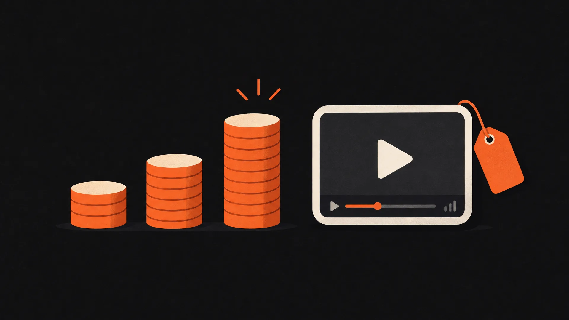
Published 2026 ranges for a custom illustrated explainer run from $1,000 to $5,000 with freelancers and $8,000 to $25,000 at full-service companies; the details are in how much an explainer video costs. A demo or promo built from your own screens is a smaller job. Our fixed prices are $79 for 30 seconds, $139 for 60 and $199 for a 90 second walkthrough, with script, motion design, AI voiceover, music and captions included, and the first version within 24 hours. Self-serve tools such as Screen Studio, Tella or Supademo are the cheapest route if someone on the team has time to record and edit.
Questions people ask
What is the difference between an explainer video and a product demo video?
How long should a SaaS demo video be?
Should a SaaS explainer use animation or screen recordings?
Where should the video go on the website?
Can one video work as both an explainer and a demo?
Topics: saas explainer video product demo video saas marketing website video
Written by
App Motion Team
The people who script, animate and deliver appmotion videos every day. What you read here is what we tell our own customers.
Plan a video for your launch.
Order a promo video online and get your first version within 24 hours.
Start your order